Create Sales Performance Charts with AI
Provide your sales data—monthly revenue, quotas, product performance, or reps' results—and AI turns it into a polished line or bar chart for reporting and analysis.
Try Sales Performance Tracking
أنشئ المخطط فورًا — أدخل وصفًا وسيقوم الذكاء الاصطناعي بالباقي.
أمثلة سريعة:

Current selected: XY Chart
اختر نوع المخطط وأدخل وصفًا
Analyze Sales in 3 Steps
From raw sales data to actionable insights
Provide Sales Metrics
List revenue numbers, time periods, product performance, or rep-specific results.
AI Generates Performance Chart
AI creates an XY chart—line or bar—that highlights patterns, growth, and comparisons.
Present Findings
Use charts in performance reviews, dashboards, investor updates, or leadership reports.
لا يتطلب تسجيلًا · لا حاجة لبطاقة ائتمان · أنشئ مخططًا انسيابيًا مجانيًا خلال ثوانٍ
Sales Tracking Features
Visualize revenue and performance trends with clarity
- Revenue Trend Analysis
- Track monthly or quarterly revenue growth to measure business performance.
- Quota vs Actual
- Visualize achievements against sales targets and identify gaps early.
- Rep-Level Performance
- Compare multiple sales reps or teams within a single chart.
- Product Category Sales
- Break down performance by product lines, SKUs, or market segments.
Sales Tracking FAQs
- What type of sales data works best?
Revenue, units sold, quota attainment, customer acquisition, retention metrics, and product category performance.
- Can I track multiple sales reps at once?
Yes. Provide each rep's data and AI will compare them within the same chart.
- Should I use bar charts or line charts?
Use line charts for trends over time; bar charts for categorical or segmented comparisons.
- Can I include targets or benchmarks?
Yes. Add goal values and AI will overlay them for comparison.
- How often should charts be updated?
Most teams update weekly or monthly depending on reporting cadence.
أمثلة مشابهة
اكتشف أمثلة استخدام ذات صلة
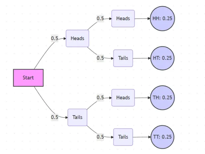
Probability Tree Diagram Generator
Create a probability tree diagram online to visualize conditional probability, dependent events, and multi-step outcomes. Use it as a probability tree diagram calculator for examples, exams, and real-world problems.
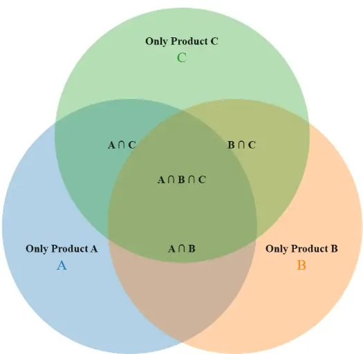
Venn Diagram Maker
Create Venn diagrams online with an easy-to-use Venn diagram maker. Generate 2, 3, 4, or more circle Venn diagrams for math, statistics, probability, and data visualization — free and online.
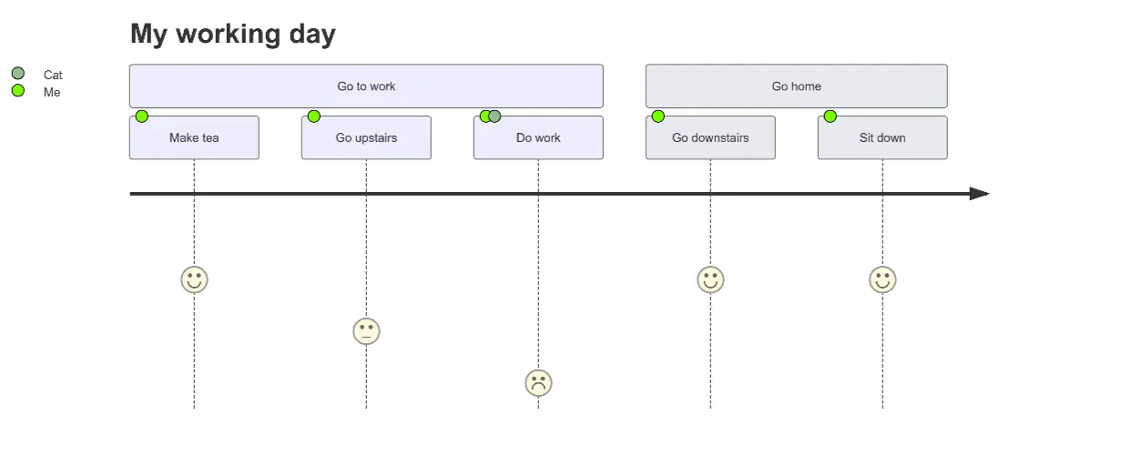
User Journey Map Maker
Generate clear, structured customer journey maps with AI. Visualize touchpoints, emotions, pain points, and satisfaction across the entire experience.