Create Pie Charts with AI
Explain your data distribution—market share, budgets, resource allocation—and AI instantly converts it into a professional pie chart with labeled segments and percentages.
Try Pie Chart Maker
AIで図表を即時生成。まずは説明を入力してください。
クイック例:

Current selected: Pie Chart
図表タイプを選び、説明文を入力してください
Create Pie Charts in 3 Steps
From data input to presentation-ready visuals
Provide Data
List your categories and their values or percentages in plain text.
AI Generates Chart
AI creates a proportional pie chart with clean labels and segment colors.
Present Insights
Export the chart for reports, dashboards, slide decks, or stakeholder presentations.
登録不要 · クレジットカード不要 · 数秒で無料フローチャート作成
Pie Chart Features
Professional-grade visualization with zero manual design
- Automatic Percentages
- AI calculates percentages for each category—even when only raw values are provided.
- Clear Segmentation
- Colors and labels ensure distinct, readable categories.
- Market Analysis
- Ideal for competitive breakdowns, product mix, and demographic segmentation.
- Budget Visualization
- Show spending distribution for finance, planning, or presentations.
Pie Chart Maker FAQs
- What data works best for pie charts?
Any dataset where parts form a whole: market share, revenue segments, demographics, budget allocation, or product distribution.
- How many segments should I include?
For readability, keep 5–7 major segments. Combine small segments into an 'Other' category to avoid clutter.
- Can I use pie charts for time series data?
Pie charts visualize proportions at a single point in time. For trends, consider line or bar charts instead.
関連ユースケース
似たユースケースを探す
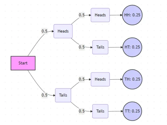
Probability Tree Diagram Generator
Create a probability tree diagram online to visualize conditional probability, dependent events, and multi-step outcomes. Use it as a probability tree diagram calculator for examples, exams, and real-world problems.
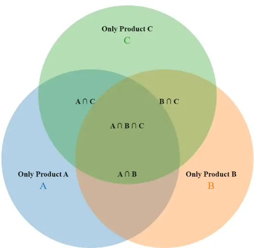
Venn Diagram Maker
Create Venn diagrams online with an easy-to-use Venn diagram maker. Generate 2, 3, 4, or more circle Venn diagrams for math, statistics, probability, and data visualization — free and online.
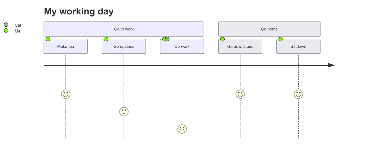
User Journey Map Maker
Generate clear, structured customer journey maps with AI. Visualize touchpoints, emotions, pain points, and satisfaction across the entire experience.