Create XY Charts with AI
Describe your data—sales numbers, growth metrics, comparisons, time-series trends—and AI instantly generates professional XY charts including lines, bars, or combined formats.
Try XY Chart Maker
AIで図表を即時生成。まずは説明を入力してください。
クイック例:

Current selected: XY Chart
図表タイプを選び、説明文を入力してください
Create XY Charts in 3 Steps
From raw numbers to clear visual insights
Provide Data
List your X and Y values, categories, time periods, or multiple data series in plain text.
AI Generates Chart
AI produces a clean visualization using line charts, bar charts, or a hybrid combination depending on your data.
Present & Analyze
Use your chart for dashboards, reports, strategy reviews, or decision-making sessions.
登録不要 · クレジットカード不要 · 数秒で無料フローチャート作成
XY Chart Features
Transform complex datasets into easy-to-understand visuals
- Trend Analysis
- Plot time-based trends to reveal growth, decline, seasonal patterns, and performance shifts.
- Multiple Series Comparison
- Compare different KPIs or categories in a single chart for side-by-side evaluation.
- Sales Tracking
- Track revenue, quotas, product performance, or monthly progress visually.
- Flexible Chart Formats
- Choose line, bar, or mixed charts depending on your data and presentation needs.
XY Chart Maker FAQs
- What data can I visualize?
Any paired X/Y data such as sales trends, user growth, financial metrics, temperature readings, KPI comparisons, or time-series analytics.
- Can I show multiple data series?
Yes. You can visualize multiple sets of Y values across the same X-axis to compare results.
- Should I use bars or lines?
Use bars for categorical comparisons and lines for trend visualization. You can also combine both for hybrid charts.
関連ユースケース
似たユースケースを探す
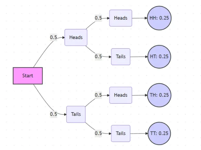
Probability Tree Diagram Generator
Create a probability tree diagram online to visualize conditional probability, dependent events, and multi-step outcomes. Use it as a probability tree diagram calculator for examples, exams, and real-world problems.
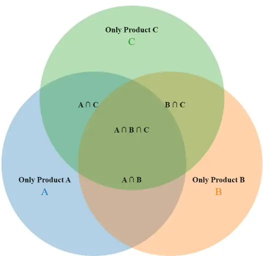
Venn Diagram Maker
Create Venn diagrams online with an easy-to-use Venn diagram maker. Generate 2, 3, 4, or more circle Venn diagrams for math, statistics, probability, and data visualization — free and online.
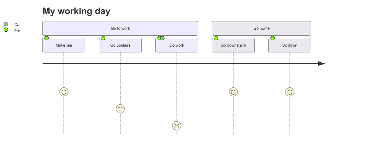
User Journey Map Maker
Generate clear, structured customer journey maps with AI. Visualize touchpoints, emotions, pain points, and satisfaction across the entire experience.